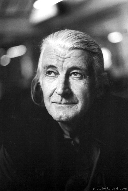
Verdana is a humanist sans-serif typeface designed by Matthew Carter for Microsoft Corporation, with hand-hinting done by Thomas Rickner, then at Monotype. Demand for such a typeface was recognized by Virginia Howlett of Microsoft's typography group and commissioned by Steve Ballmer. The name "Verdana" is based on verdant (something green), and Ana (the name of Howlett's eldest daughter).
Bearing similarities to humanist sans-serif typefaces such as Frutiger, Verdana was designed to be readable at small sizes on the low-resolution computer screens of the period. Like many designs of this type, Verdana has a large x-height (tall lower-case characters), with wider proportions and loose letter-spacing than on print-orientated designs like Helvetica. The counters and apertures are wide, to keep strokes clearly separate from one another, and similarly-shaped letters are designed to appear clearly different to increase legibility for body text. The bold weight is thicker than would be normal with fonts for print use, suiting the limitations of onscreen display. Carter has described spacing as an area he particularly worked on during the design process.
Released in 1996, Verdana was bundled with subsequent versions of the Windows operating system, as well as their Office and Internet Explorer software on Windows, classic Mac OS, and Mac OS X. Since at least Mac OS X 10.4 it is even bundled with macOS itself. In addition, up until 2002 it was available for download from Microsoft's web site as freeware (".exe" files for Microsoft Windows and in ".sit.hqx" archives for Mac OS) under a proprietary license imposing some restrictions on usage and distribution, allowing it to be used by end users in any system supporting installation of "exe" or ".sit.hqx" files and supporting TrueType fonts. The downloadable files are still available legally from third-party web sites; see the External links section. However, these files include only old versions of Verdana and updated versions are not available as a freeware.
According to one long-running survey, the availability of Verdana is 99.70% on Windows, 98.05% on computers running Mac OS, and 67.91% on free operating systems like Linux.
According to a study of online fonts by the Software Usability and Research Laboratory at Wichita State University, participants preferred Verdana to be the best overall font choice and it was also perceived as being among the most legible fonts. However, Microsoft's font manager Bill Hill wrote of it that "with its large x-height and very generous spacing, it never felt comfortable as an eBook font", and noted that Microsoft had commissioned an alternative, version of the pre-existing typefaces Berling and Frutiger, for its Microsoft Reader e-book product. Despite this, Verdana was initially used as one of the bundled book-reading fonts on the iPad before an update in 2011.
